Overview
For anyone that deals with money on a daily basis, cashflow tracking is not an uncommon need, and cashflow tracking tools are not an uncommon thing. In fact, a quick browse on the App Store would show that there is a myriad of applications offering this functionality on the market.
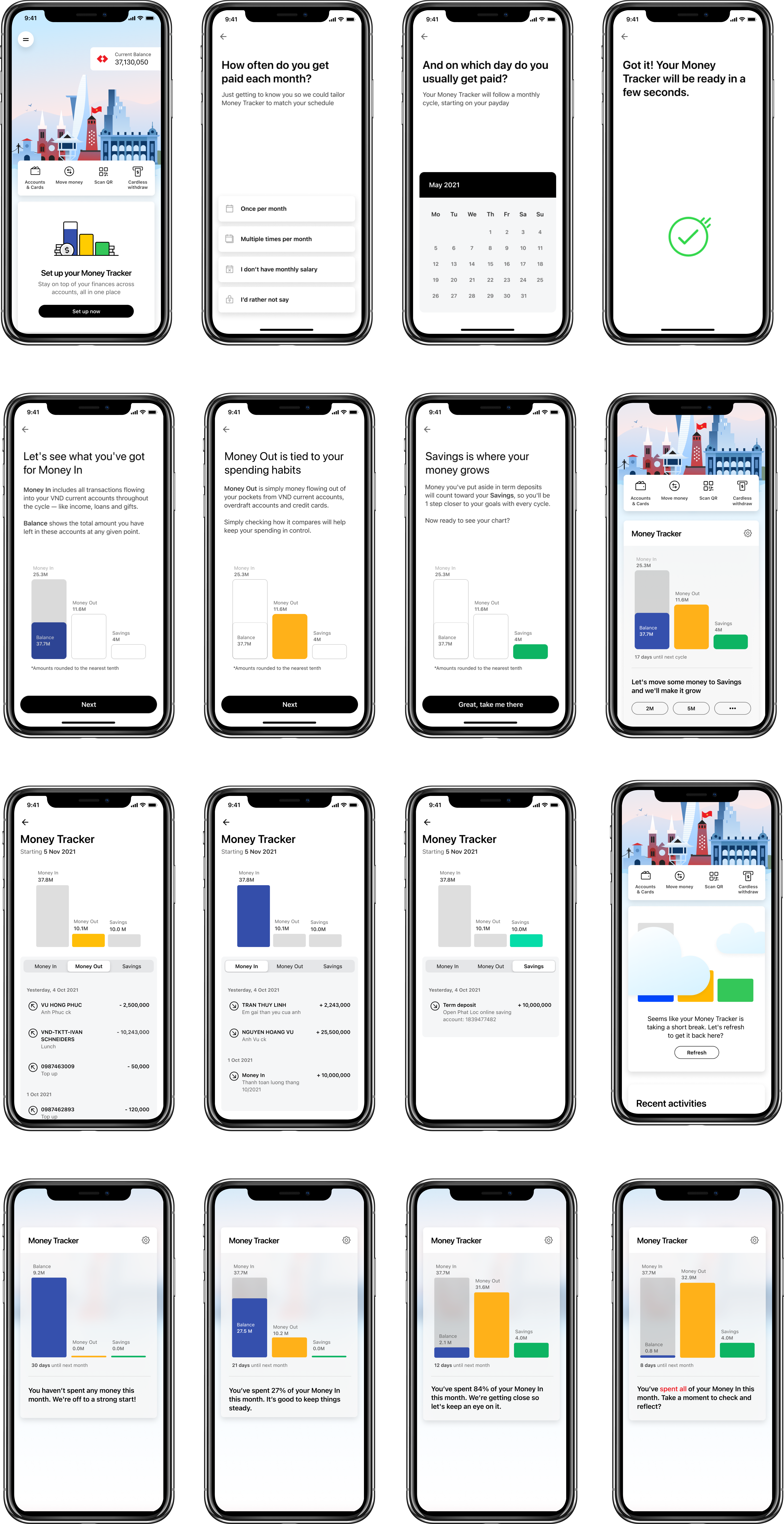
Money Tracker was built to serve this ever-present and ever-growing need for managing personal finances. It’s a module displayed directly on the dashboard – the front page of the Techcombank Mobile App – and updated with every transaction, so users can get a quick overview of their finances every time they log in.
How I helped
When I joined the team, the design for this feature was already close to completion, with a fully fleshed-out concept and clearly defined flow and structure. There were only a few UI tweaks on the way, plus an accumulation of copy issues that had, until then, been unresolved. My job there included:
- Writing and enhancing onboarding copy, with heavy emphasis on product explanation
- Revising messaging framework for progress tracking during use – from functional to conversational
- Producing other copy for Detailed View, Pre-onboard state, Empty state and Error states
Onboarding copy
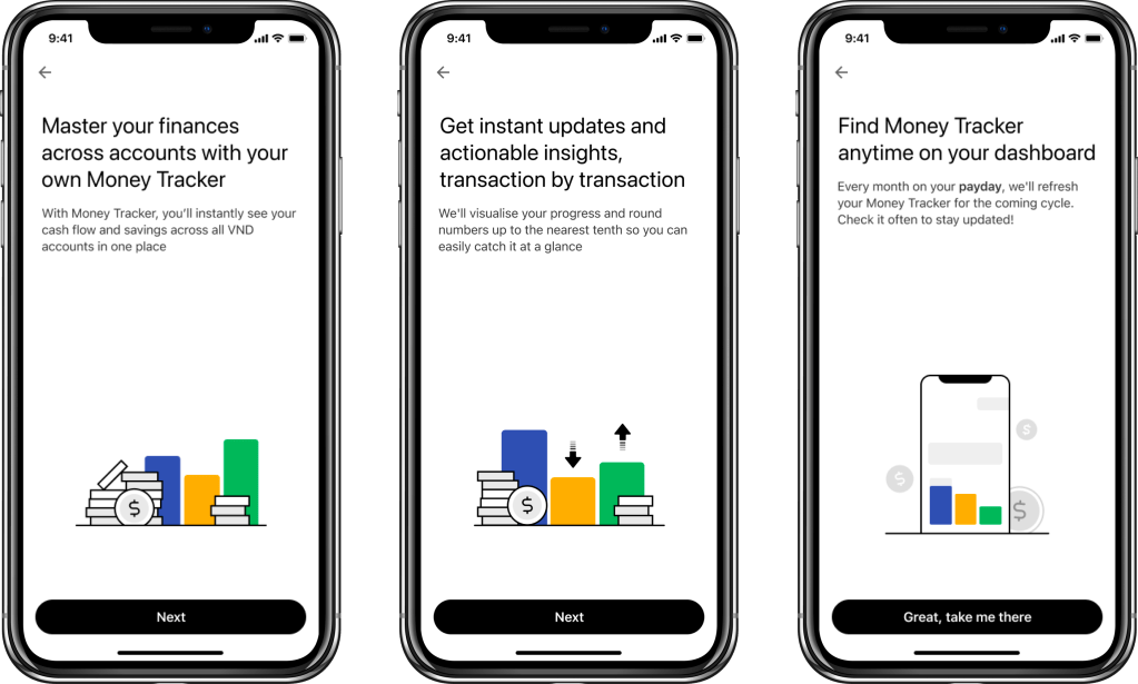
In the onboarding flow, we had 3 screens dedicated to product explanation. Information that needed to be conveyed includes:
- What it is and what it’s for
- When it applies
- How it works
- Where to find it
- Other product specs per legal requirement (rounded numbers, limited to VND accounts)
- … And make it more punchy in terms of benefits!
Before:
This was the original copy before I joined the team.
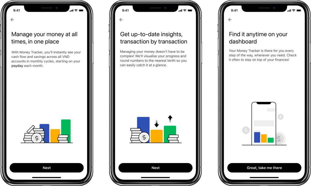
Revision 1:
- Added information on product specs
- Added information on Where to find it
- Changed title copy angles to be more punchy and focused on benefits
However, this copy was still too long and heavy, especially on Screen 1.
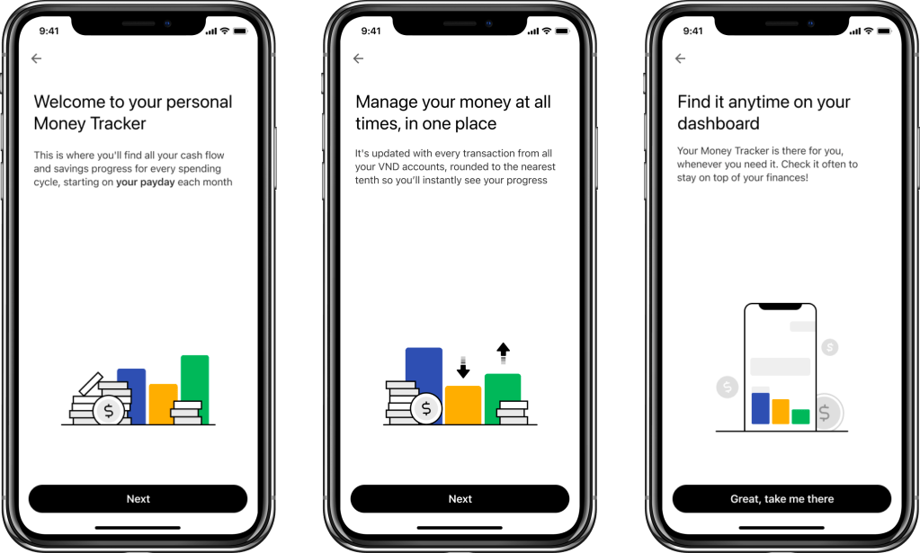
Revision 2:
For this revision, I focused mainly on rearranging information structure and tightening up copy so everything is more evenly spread out.
2.1:
- Screen 1: What? – cashflow across accounts
- Screen 2: How? – insightful and digestible
- Screen 3: When & where? – dashboard, payday
2.2:

- Screen 1: What? – cash flow across accounts, rounded
- Screen 2: How? – visualised progress, smart insights
- Screen 3: When & where? – payday, dashboard
2.3:
- Screen 1: What? – cash flow across accounts; When? – monthly cycles
- Screen 2: How? – updated, visualised progress; rounded and digestible
- Screen 3: Where? – dashboard
These revisions saw improvements in terms of comprehension in guerrilla testing, but we found that users had relatively low motivation to read through all information presented due to an extension of the “banner blindness syndrome” – automatically skipping anything deemed as advertising or promotions.
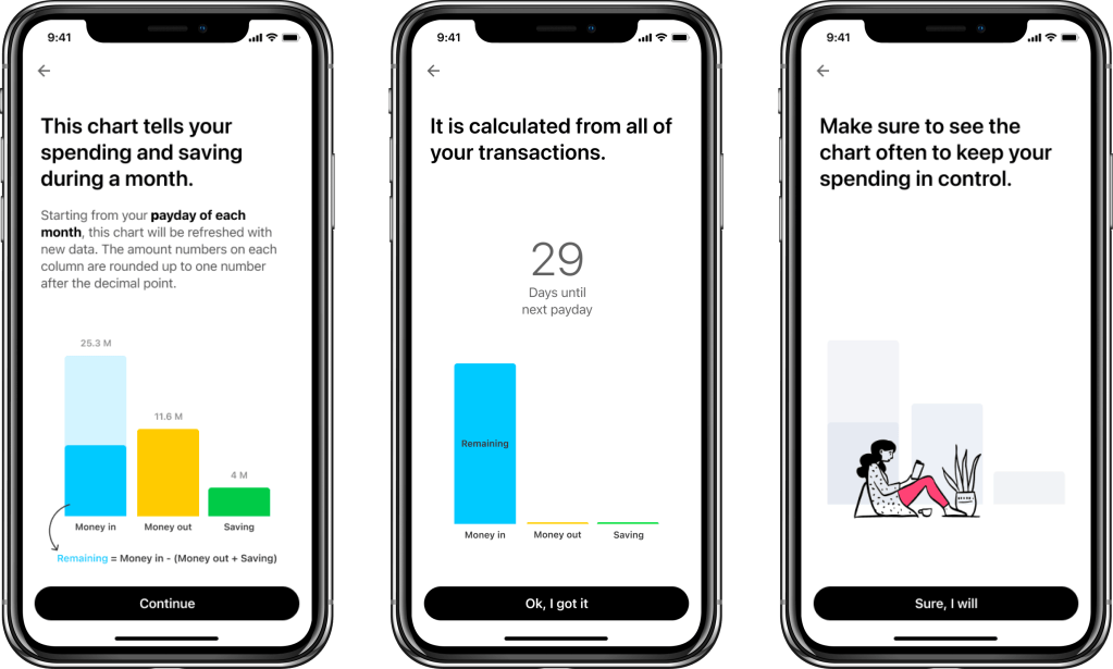
Revision 3:
From previous findings, I turned my focus to more explaining and less selling. Copy can still be punchy, but not necessarily overly promotional.
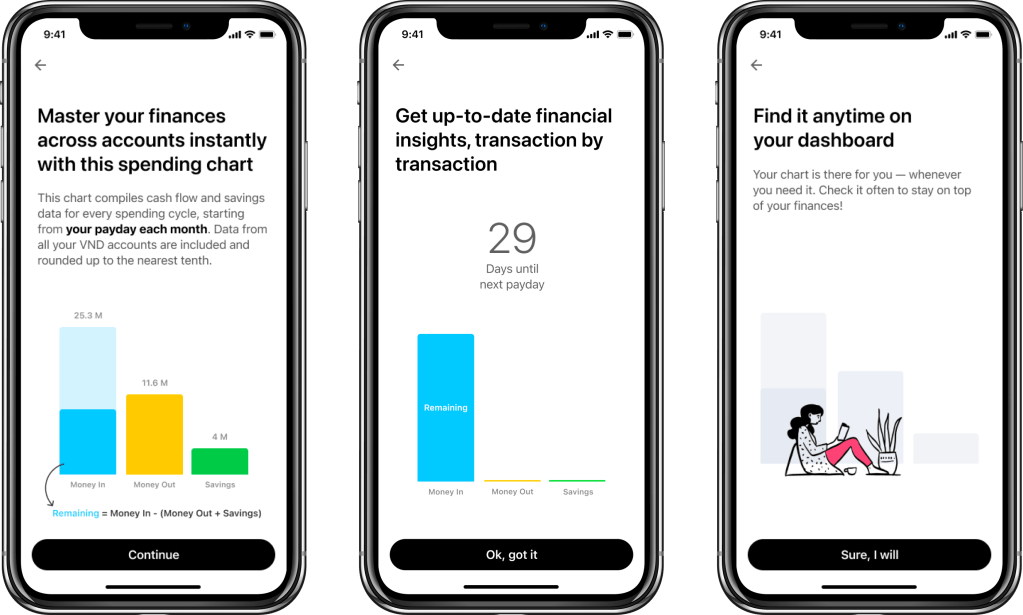
Revision 4:
New product complications arose, which increased the level of complexity and required even more detailed clarification. To meet this requirement of ensuring maximum clarity, I produced a new set of copy, complete with a wireframe for illustration. This became the final version that made it into production.
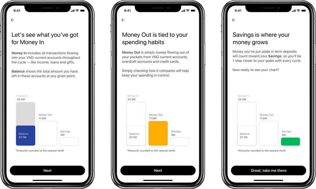
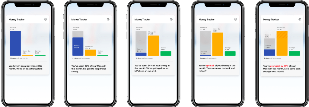
Progress tracking
Once the Money Tracker is set up, our users will be able to track their cashflow and spending progress every time they log into the app. The existing messaging framework for progress tracking was a basic nugget of information to let them know how much of their money they have spent that month. Working with the UX Designer and Business Analyst, I enhanced the framework with more contextual messages and conversational tone of voice, so it feels truly like a companion, rather than a machine that is speaking to the user.

The final result